Our client work
Real projects. A working example.
These are websites our studio built for real businesses, most of them in Arkansas and Missouri. Open any project to see what the business needed and what we built. Further down, this website itself is a working example you can try.
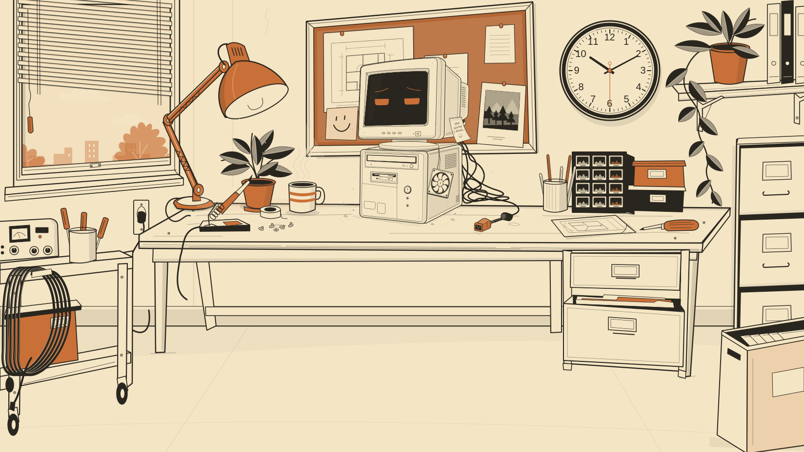
Questionable company.
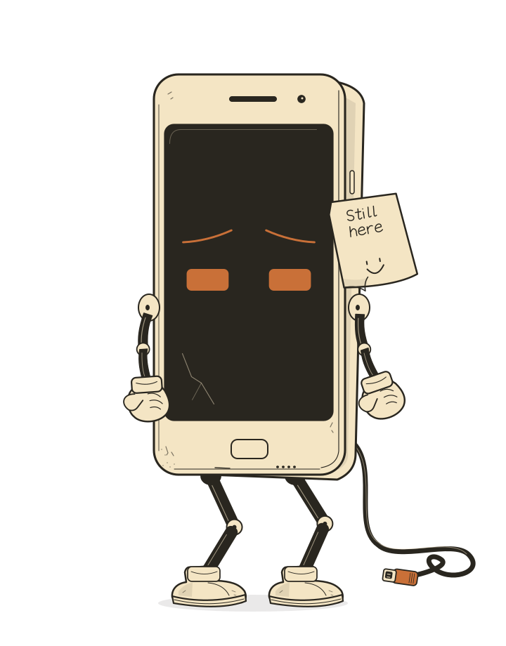
Meet the characters.
Five different personalities, and a little room to be themselves.
Arkansas Counseling and Wellness
A counseling practice with offices in Fayetteville, Bentonville and North Little Rock. Its team page is edited by the practice itself.
See what we builtWhite River Cabins
Six rental cabins above the White River near Eureka Springs, each with its own page and a direct path to booking.
See what we built2 Bee Done Home Services
A Pea Ridge remodeler and handyman moved off a page builder onto a hand coded site with a page for each kind of job.
See what we builtInfectious Disease Specialists of Northwest Arkansas
A Fayetteville specialist practice that sees new patients by referral, with a clear intake path for referring offices.
See what we builtSteele Solutions
A Branson merchant services team whose five service lines each get their own page.
See what we builtGreenough’s Guide Service
A fishing guide on Table Rock Lake and Lake Taneycomo, with a website built around booking a trip.
See what we builtLocal Living Real Estate
A mother and daughter brokerage in Huntsville, Arkansas, ready for homes, land, farms and commercial listings.
See what we builtEureka Bath Works
A handmade bath and body shop in Eureka Springs that customers browse by scent.
See what we builtShowMeClean NWA
A Barry County cleaning service whose scattered web addresses now lead to one site.
See what we builtFederal Group Talent Partners
A federal recruiting firm with separate paths for employers and cleared candidates.
See what we builtSolution Gear Co.
A Houston gearbox repair shop whose two old websites became one, with a page for every repair and brand.
See what we builtHeritage Hardwood Floors
A Bella Vista flooring contractor with town pages, a cost guide and service pages in the words homeowners use.
See what we builtBeyond A Step
A Northwest Arkansas nonprofit for first responders and veterans that puts crisis help ahead of fundraising.
See what we builtWeCoverUSA
A national administrator of dealer service contracts, with pages for every product and every kind of dealership.
See what we builtThe brief: make a service business memorable and understandable
The visual idea is an illustrated office with a cast of computer characters. The practical job is to explain four website services and help a visitor describe a project. You can inspect both parts here: the artwork and interactions, then the information and next steps behind them.
Link to this answerCan an animated business website load quickly?
This website provides one measured example. A PageSpeed Insights test of the public homepage on October 15, 2026 at 8:20 PM CDT recorded a mobile performance score of 99 and a desktop score of 100. The mobile run reported Largest Contentful Paint of 1.8 seconds, Total Blocking Time of 20 milliseconds and Cumulative Layout Shift of 0. Accessibility, best practices and SEO each scored 100 in that run.
The mobile test used Lighthouse 13.5 with an emulated Moto G Power and slow 4G conditions. These are laboratory observations of this page at that time. The report had insufficient Chrome user-experience field data, so it does not establish real-user Core Web Vitals, manual accessibility conformance, search positions or client business results.
Inspect the October 15 mobile PageSpeed report
Inspect the matching desktop report
Link to this answerHow can I check the performance example myself?
Open the dated report to inspect its device, network conditions and diagnostic details. For a fresh comparison, run the same public homepage through PageSpeed Insights with the same form factor and record the new test time. Keep mobile and desktop results separate; a later release, device profile or network condition can change the result.
Then try the actual visitor task: read a service, follow a related link, pause the motion and reach the project brief. The lab result answers a loading question. Completing the task answers a different usability question. A useful acceptance record keeps both, with the exact page and scope of each test.
Try the service selection journeyInspect the project processRun a new PageSpeed Insights test
Link to this answerTwo ways through the same website
On the homepage, office objects lead to services, the process and getting in touch. The main navigation offers direct links to those destinations too. Compare the two routes: an exploratory visitor can look around, while someone who already knows what they need can go straight to the relevant page.
Explore the interactive homepageCompare the four services directlyCharacters with controls you can try
The character stage on this page offers character and expression choices, movement controls and a short performance. Try the controls, then use the pause option. With reduced motion enabled, the stage offers still expressions. These are specific interaction choices you can evaluate when deciding how much motion belongs on your own website.
From a service question to a project brief
The repair page answers whether a website needs a repair or a rebuild. The design page explains what content to bring. Both lead to the same project brief, which asks about the business, the type of help needed and the problem to solve. Review the questions without sending a message to see how the inquiry is framed.
Read the repair-or-rebuild explanationReview the project briefLink to this answerWhat can you inspect in this example?
This is a first-party demonstration: the work being described is the website you are using. The public pages deliver their headings, service explanations and ordinary links in the initial page. The illustrated room and character controls add another way to explore that content.
- Open a service directly, then use its breadcrumbs and related links to move through the site.
- Try the motion control or your device’s reduced-motion setting while reading the same information.
- Follow the organization link to see who provides the services and how the related websites connect.
- Review the project brief and privacy explanation before deciding what information to send.
What does this example demonstrate?
It demonstrates the site’s visual approach, navigation, character interaction and service-to-inquiry design. It is an owned project rather than a client testimonial. No client revenue increase, search ranking or conversion result is attributed to this example. The right level of motion and detail for your project should follow your audience and the task they need to complete.
Link to this answerWhat should your website feel like?
Your project does not need an animated office. It needs an approach that fits your audience, content and goals. Share what you want people to understand or feel, and the design conversation can start there.
Explore website design